# A tibble: 2 × 5
  term              estimate std.error statistic   p.value
  <chr>                <dbl>     <dbl>     <dbl>     <dbl>
1 (Intercept)        -5781.     306.       -18.9 5.59e- 55
2 flipper_length_mm 49.7 1.52 32.7 4.37e-107Project title
STA/ISS 313L - Spring 2026 - Project 1
Team name
Using Quarto for presentations
Quarto
The presentation is created using the Quarto CLI
##sets the start of a new slide
Layouts
You can use plain text
- or bullet points
or text in two columns \(^*\)
- like
- this
Code, hidden
Model output:
Code, visible
You probably won’t want to do too much of this, but if there’s something specific you want to show about your code…
Code, collapsed
Or have the option to show:
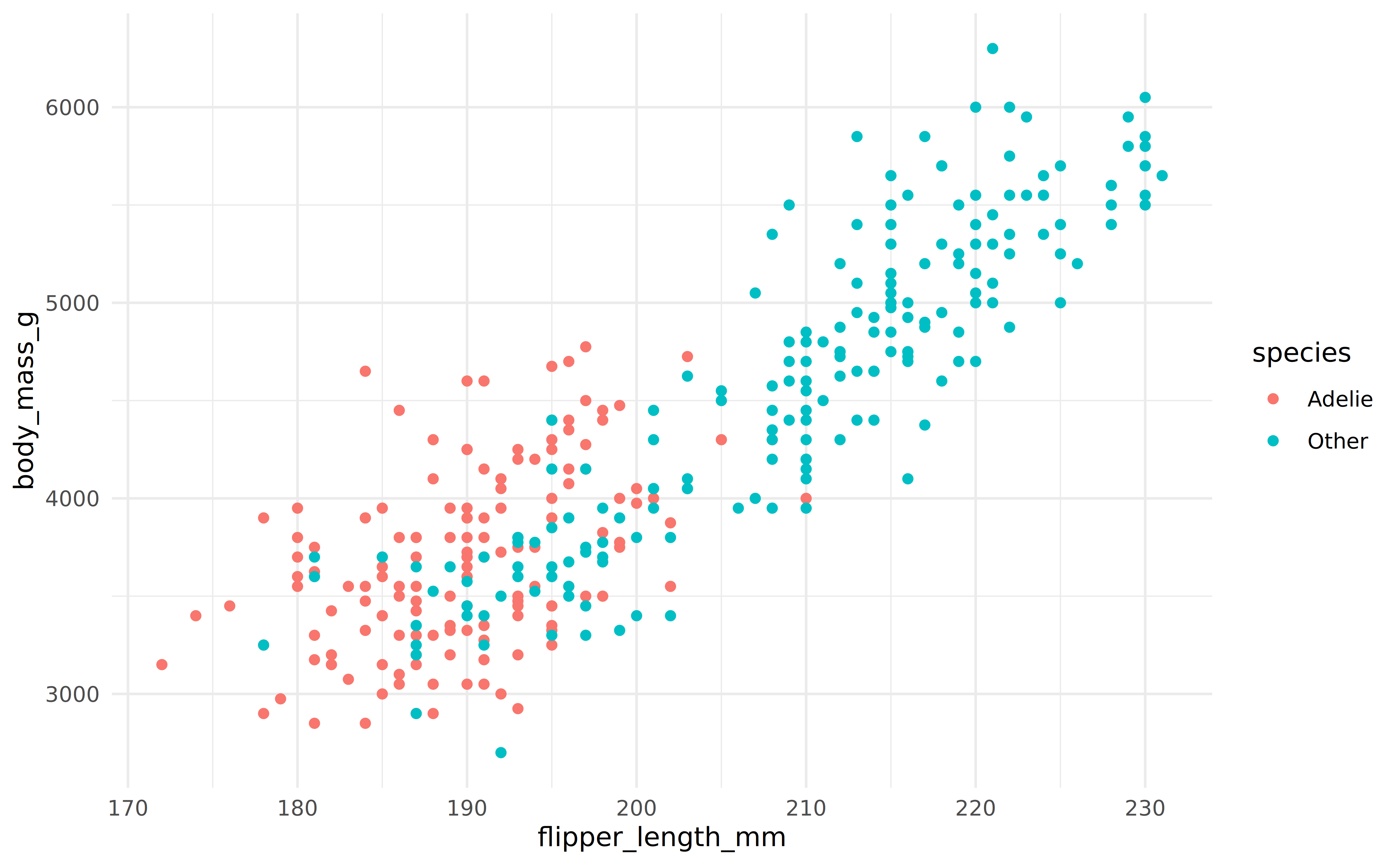
Plots
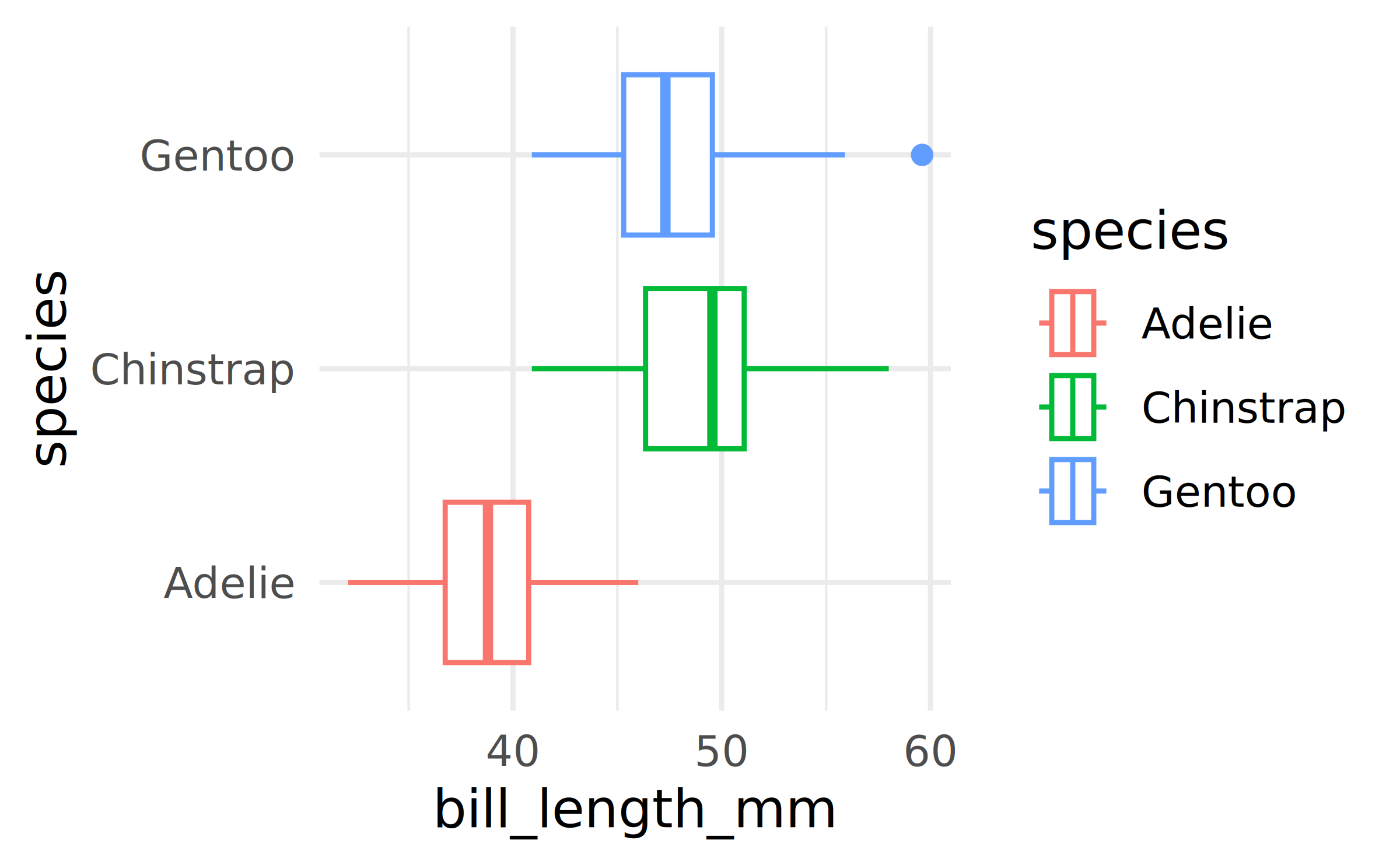
Plot and text
- Some text
- goes here
A new section…
Tables
If you want to generate a table, make sure it is in the HTML format (instead of Markdown or other formats), e.g.,
| species | island | bill_length_mm | bill_depth_mm | flipper_length_mm | body_mass_g | sex | year |
|---|---|---|---|---|---|---|---|
| Adelie | Torgersen | 39.1 | 18.7 | 181 | 3750 | male | 2007 |
| Adelie | Torgersen | 39.5 | 17.4 | 186 | 3800 | female | 2007 |
| Adelie | Torgersen | 40.3 | 18.0 | 195 | 3250 | female | 2007 |
| Adelie | Torgersen | NA | NA | NA | NA | NA | 2007 |
| Adelie | Torgersen | 36.7 | 19.3 | 193 | 3450 | female | 2007 |
| Adelie | Torgersen | 39.3 | 20.6 | 190 | 3650 | male | 2007 |
Images

Image credit: Johannes Uiga. CC0. https://unsplash.com/photos/rJ3iNrYaWNk
Math Expressions
You can write LaTeX math expressions inside a pair of dollar signs, e.g. $+$ renders \(\alpha+\beta\). You can use the display style with double dollar signs:
$$\bar{X}=\frac{1}{n}\sum_{i=1}^nX_i$$\[\bar{X}=\frac{1}{n}\sum_{i=1}^nX_i\]
Limitations:
The source code of a LaTeX math expression must be in one line, unless it is inside a pair of double dollar signs, in which case the starting
$$must appear in the very beginning of a line, followed immediately by a non-space character, and the ending$$must be at the end of a line, led by a non-space character;There should not be spaces after the opening
$or before the closing$.
Smaller text
Sometimes you have too much text and it doesn’t fit in the slide. This is likely bad practice, but if you feel you must squeeze it in, you can add {.smaller} next to the slide title to make the text smaller. There are ways of making it even smaller, don’t go down that path!
This is what ChatGPT says about how much of a bad practice it is, just to fill up this slide…
A slide full of text is ineffective because it overwhelms the audience and forces them to read and listen at the same time, which significantly reduces comprehension. When people see a dense block of words, their attention shifts away from the speaker and toward the slide, causing them to miss key explanations or emphasis. In addition, text-heavy slides often result in small fonts and cluttered layouts that are hard to read, especially from a distance, making the presentation feel tiring and uninviting.
Furthermore, slides packed with text diminish the role of the presenter. If everything is written out, the speaker adds little value and may end up reading directly from the slide, which feels monotonous and disengaging. Effective slides should highlight key ideas, visuals, or prompts that support what is being said, not act as a script. By keeping slides concise and visually focused, presenters improve clarity, maintain audience attention, and make their message more memorable.
Wrap up
Feeling adventurous?
You are welcomed to use the default styling of the slides. In fact, that’s what I expect majority of you will do. You will differentiate yourself with the content of your presentation.
But some of you might want to play around with slide styling. Some solutions for this can be found at:
- Simpler option – using
_brand.yml: https://quarto.org/docs/authoring/brand.html
- Requires deeper understanding of and/or more willingness to experiment with styling for the web – using SCSS: https://quarto.org/docs/presentations/revealjs
- Simpler option – using